
Canada Post Annual Report
Canada Post’s Annual Report serves as more than just a vehicle to communicate financial performance of the previous year. It is often called upon to form the narrative for the coming year. To highlight key messages about the challenges and opportunities ahead.
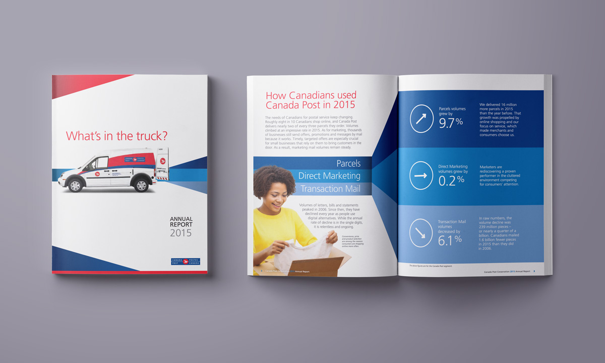
As 2016 began, Canada Post had a key message to deliver to its shareholder, the Government of Canada, its customers and to all Canadians. That message was that postal needs of Canadians weren’t changing – they had already changed. Canada Post was delivering far fewer letters, and far more parcels.
I worked with senior management and came up with the cover line “What’s in the truck” that anchored the story that what we were delivering had fundamentally changed. And crafted the front section of the report to reinforce that message through text and visuals.
I have been fortunate to conceptualize and design all of Canada Post’s Annual Reports for the past 20 years.

Canada Post truck livery
The way parcels and letters has changed over the years. Now, Canada Post goes into neighbourhoods once, doing all deliveries and pickups with one truck. This change necessitated adding many new small vans to the fleet.
With very little time, I was asked to adapt the previous truck livery design to the new vans, a design that included painting the top half of the truck red, then applying vinyl graphics.
As I worked on the design, i proposed a different solution that eliminated the need to paint first, but still resulted in a dynamic look that was recognizable with the existing fleet.
My design was approved, and it saved the company in the neighbourhood of $1 million over just the first allotment of vans. It’s an example of keeping overall business goals in mind while designing, and it is still a thrill to see these trucks in every neighbourhood, every day!
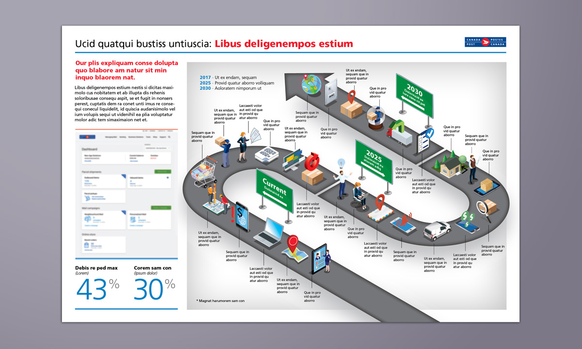
Explainers
I love working with clients to delve into a complex process or strategy, and finding a way to simplify it so it can be clearly communicated.
I've done many of these visual explainers over the years, However, due to the nature of their content, most fall in the protected status, and are therefore not shareable.
Designing and illustrating these explainers is very enjoyable, but the real thrill is the journey of helping clients clarify and realize their own process or vision.
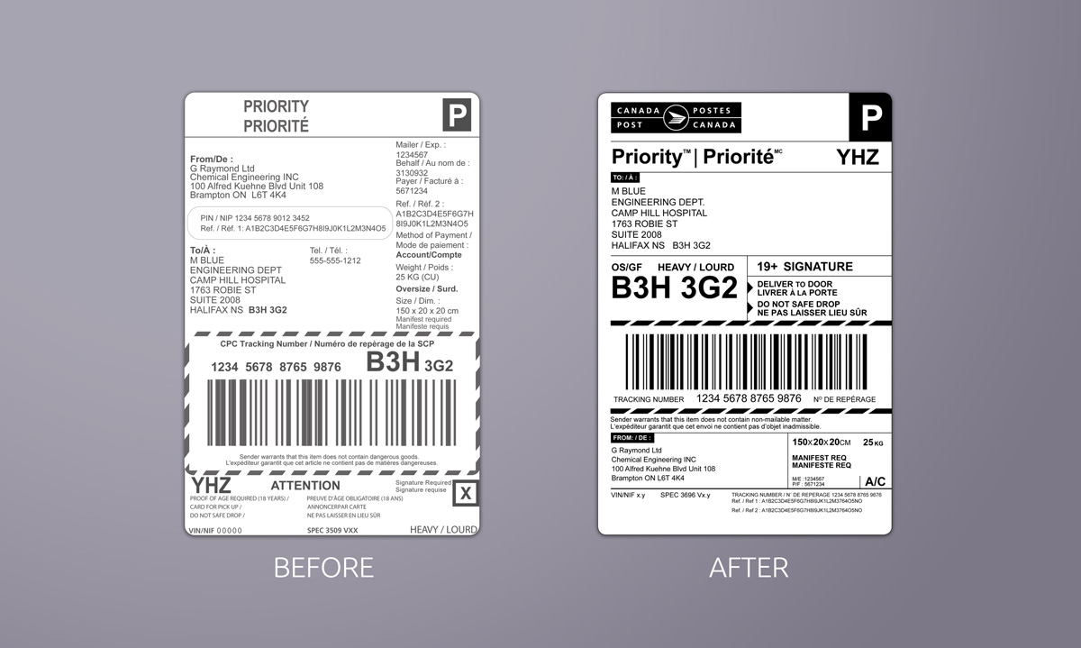
Canada Post Parcel labels
You may not find label designs in many graphic designer porfolios. Some might say they are not the most glamourous of design challenges.
But I am including this project because I feel it gets to the essence of what graphic design is all about – visualizing communication so it is clear and understandable.
The job began because Canada Post’s burgeoning parcel business was hampered by the fact their labels didn’t have its logo on them. So customers were happy with the service, they just didn’t know who they were happy with!
As we started into the project, it became clear the information on the label was not structured clearly at all for the main users, those who had to sort and deliver the parcels. I enjoyed going deep into understanding the process and soon compartmentalized the information accordingly. As the labels had a myriad of variations, and had to be printed on very primitive printers by some customers, there were definitely constraints that had to be met. But by all accounts, the labels have been successful on all fronts.

Cards and invitations
Effective communications that make an impact involve more that just visual design. I enjoy the overall creative process, and often write headlines, content titles, ad copy and summary blurbs to highlight key ideas in a creative way. The Christmas card above conveys not only holiday greetings, but also reinforces Canada Post’s e-commerce business. The simple cover line expands to a full statement when the card is opened. The invitation to our F1 stamp launch playfully reveals the launch details behind a checkered flag.
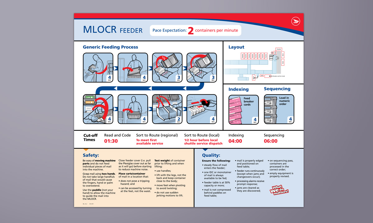
Plant signage and wayfinding
Canada Post has many facilities and sorting machines across the company. I was asked to take the design lead on reviewing the company-wide situation, creating a design system, and creating understandable infographics and signage. This was a wide-ranging project, including consultations with many groups, plant visits and clarification of processes.
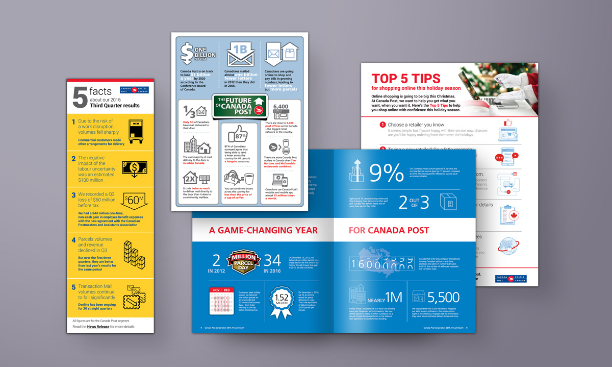
Infographics
Infographics are important tools to help an audience understand information easily. They can help translate often complex data into bite-size, digestible chunks. I have always enjoyed designing and illustrating infographics for a wide range of projects. But I have also had a lot of experience analysing supplied content, whether it be editorial articles, process descriptions, or financial data, and distilling it to the simple statements or statistics that lend themselves to infographics.
In communicating with customers, media, all Canadians, or its 60,000 employees, infographics are used regularly at Canada Post and I have worked on many of them.